Review Detail
9.5 4 10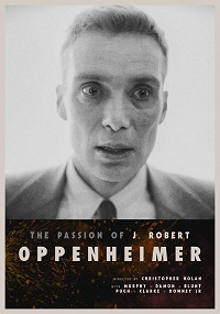
Overall rating
9.6
Audio/Video Quality
10.0
Audio Editing
10.0
Visual Editing
10.0
Narrative
9.0
Enjoyment
9.0
Gibichung's edit of "Oppenheimer" offers a refreshing take on Christopher Nolan's flawed film, enhancing the viewing experience in several key ways.
First and foremost, the decision to present the movie in 4K full-screen 16:9 format is a stroke of brilliance. While this choice may crop the frame, all home video versions of this movie are cropped in some way, at least the IMAX footage. I like how the entire movie fills the frame. It is crisp and detailed. This is a much better way of viewing it at home. It keeps the style and tone of the director while improving the storytelling. The addition of the on-screen titles that tell you who these famous figures are was an interesting choice and it makes sense. Nolan’s film sprints through the introductions of a small army of famous scientists without making their names memorable. It improves on his style choices by going all in with the black and white vs color time jumps. It is clearer now when we are in the present of the 1950s or the past of the 1930s-40s. He avoided showing RDJ too soon in the film so we can live in the 1940s longer and it separates the timelines in a cleaner more logical manner. He did the same thing I did in my edit of “Oppenheimer” by making the story more linear. I just stopped in 1945. It would have just been so much better if Nolan had shot the entire movie in color. He even had Kodak create a from-scratch black and white 65mm film stock as well as a new process to develop it. Such a waste of time and resources. Black and white and IMAX don’t go together but I think that Nolan is just grasping at things that can make his films different.
Gibichung eventually switches back to color at the end of the movie and removes Stauss’ boring black-and-white Senate confirmation hearings. The edit has one of the same problems that the original has, although it greatly minimizes it, and that is: after Trinity, the movie starts to slow down to a crawl. The black and white does not help. Yet I preferred watching it like this over the constant cross-cutting Nolan and editor Jennifer Lame did in the theatrical cut.
I really can’t get over how good a decision it was to crop in on the frame to make the whole film 16:9. It is a nice median between the square IMAX frame and the anamorphic widescreen. Nolan’s film has FOUR different aspect ratios 2:20:1, 1:43:1, 1:90:1, and 1:78:1. For my edit I went with the widescreen format of 2:20:1 and Gibichung went with the full frame 16:9 which I wish I had thought of. If you watch interviews with the cinematographer Hoyte van Hoytema he says that he had to compose every shot in the movie directly in the center. The reason he did this is because of the square IMAX format that some of the footage was shot in. Anything not in the center can only be seen with peripheral vision in an IMAX theater. Every shot framed the same way = boring. Nolan is limiting himself by visually appealing only to a small demographic of people who will see the movie, the IMAX audience. There are only 19 IMAX theaters in the United States. The closest one to me is over an hour away. He expects people to drive for multiple hours to experience his “vision.” It would be much more efficient to play to the home video or standard anamorphic theatergoer. Nolan is a bit of a Luddite in that he rejects the digital home theater experience. But a boring movie is a boring movie no matter how it’s viewed. Watching it at home on a 1080 projector with 5.1 just isn’t that much different than watching it on a massive film reel in an IMAX theater. The movie is still the movie.
I also really liked the poster for this cut. When I first saw it, it reminded me of "The Passion of Joan of Arc" before I even read that it was intentional. Nicely done!
User Review
Format Watched?
Digital
K