Review Detail
7.3 19 10
(Updated: September 25, 2012)
Enjoyment
6.0
adabisi - dec 29 2009
Wall-e Fantasy
Nice little short and well edited, but it felt like it ended halfway through the story. 7/10
Alien Elements
Lots of motion blur in the video. Nice idea and well edited, but no real central characters to speak of or care about really hurt this one. A few nagging inconsistencies that bothered me as well. And the whole thing takes place on Earth. Which, I guess technically, is in space… 6/10
Humans are Limited
Not going to rate my own edit.
Aggressive Negotiations
Well edited, but the narrative can’t stand on it’s own and would be fairly confusing without knowledge of the greater Star Wars universe. 5/10
Star Wars: Episode II.I
Audio was out of synch with the video. Switches to black and white randomly. Not sure what the point of this one was. 1/10
Mayflower Madness
This was great. Provided some much needed comic relief. Lots of continuity mistakes but that’s part of this type of comedy. Fits perfectly, whether it was intentional or not. Some of the editing could have been better, though. 9/10
Klone
Very well done. Nice condensed version of Solaris. Loved the ending. Unfortunately, more motion blur in the video and dialogue coming from all 5 channels instead of being isolated to the centre. 8/10, but easily a 10/10 without the technical issues.
Humans are Limitless
More blurry video. At this point I’m starting to think the issue is somewhere in the authoring process. Made me laugh in spots and I liked the general concept but it felt more like a bunch of youtube clips mashed together than a cohesive narrative. The music video at the beginning felt horribly out of place and I hate that song (but considering this is blueyoda I’m guessing that’s the point) and the cut-off -in mid-sentence ending is just strange (again, I’m guessing that was the point). Good editing but 5/10 because it made me angry (which I’m sure was the point).
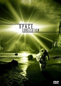
Menus
I liked the old school Atari 2600 look to them, but the font was so small it was barely legible and there was a lot of blank space that could’ve been used.
Overall, I’ll give the project a 6/10.
A

