Review Detail
9.6 22 10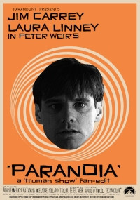
(Updated: September 14, 2022)
Overall rating
9.2
Audio/Video Quality
10.0
Audio Editing
10.0
Visual Editing
7.0
Narrative
10.0
Enjoyment
9.0
I like The Truman Show a lot more than I think I should. In fact, I'll even go so far as to say it's one of my favorite movies! The acting performances are wonderful. Jim Carrey's performance as the title character might be his finest. Ed Harris is great as the main villain. Laura Linney and Noah Emmerich are both fun as well as disturbing in their supporting roles. And the plot manages to succeed at being both chilling and inspiring at the same time. A powerful combination that few movies are able to pull off. So being the diehard fan of anything revolving around Truman, it should come as no surprise that I wanted to see this edit the moment I heard of its existence. This edit is very close to being amazing. But there's a problem with it that kicks it down to just very good. This is still worth your time, and my overall advice is "go watch this." But there's one thing this edit could've done differently that would've made it even better. I'll explain what it is in a minute.
First off, there is a lot that I love about this alternate take on The Truman Show. I think the aesthetic gives it a nice crossbreed between David Lynch, Alfred Hitchcock, Darren Aronofsky, and quite a few Twilight Zone episodes. I'm also a huge fan of Vertigo, and it'll come as no surprise that I enjoyed hearing Bernard Herrmann's legendary score throughout this edit. The removal of everything outside the show gives the film a good paranoid thriller feel (similar to movies like The Conversation, for example), and I have to say that quite a few of the static effects freaked me out in all the right ways.
Unfortunately, this edit has a flaw, and it breaks my heart to say it, but my problem is with the color grading. On paper, the combination of color and B&W is a great idea. The fictional town of Seahaven is deserving of this kind of treatment, and it makes sense in a '50's-60's era sort of way. So, what's wrong, you ask? The problem is that the color and B&W cameras are all at random. In the first two scenes, you might think there's a pattern. The tiny, microscopic camera in Truman's bathroom is in B&W, and when he heads out the door, the faraway cameras are in full color. I like that idea, and I wish the rest of the edit stuck with that kind of pattern. But when we get to Truman's office, and there's a hidden camera when he's looking through the magazine, the hidden camera shot is now in full color. My beef with this is the lack of attention to detail. You see, back in the 1950s and 1960s, black and white film was cheaper and more affordable, and while it is true that color film was increasing in popularity at this point, it was still risky to shoot in color. This is why the 1968 horror classic Night of the Living Dead was shot in B&W. This is also why Alfred Hitchcock shot Psycho in B&W as well despite shooting Vertigo and North by Northwest in color a few years back (courtesy of VistaVision, mind you). So if we are going to apply '50's-'60s aesthetics to something like The Truman Show, a director like Christof would probably place the color cameras in safer or less risky places, while B&W cameras would be placed in more dangerous situations (like the button cameras or the cameras on the ocean, for example). This is because B&W cameras would be easier to replace if something bad happened to one of them (and knowing that there are 5000 cameras around from watching the original, Christof would very much be concerned about the costs since those cameras ain't cheap). I know that what I'm suggesting is about as much fun as a root canal for the editor, but having a working knowledge of the differences between B&W and color film is necessary for an edit like this.
It's such a shame too, because if it hadn't been for that mistake, this edit could arguably be one of my favorites. I love The Truman Show, and I love the general idea and philosophy behind this edit. Had the color grading been less distracting, this edit would be a huge winner for me. As it stands, it's still worth watching, and I'm going to recommend this one wholeheartedly anyway. Just be aware that if your camerawork senses tingle a lot, this edit might bother you a little.
User Review
Do you recommend this edit?
Yes
Format Watched?
Digital
E